Ivory vs Cream: What's the Difference (and What Wall Art Looks Best With Each)
Understanding Ivory
Ivory sits between pure white and pale yellow, carrying a gentle warmth without looking overtly yellow — think natural ivory from piano keys. Its hexadecimal code is #FFFFF0 (RGB 255, 255, 240), and its undertones actually lean toward the cooler side of the spectrum, with hints of gray and sometimes blue. Yellow presence stays minimal, which keeps ivory from ever looking aged or dingy — it reads as a cool, sophisticated neutral rather than a warm one.
North-facing rooms emphasize ivory's cooler undertones, while south-facing rooms bring out its subtle warmth. It's worth testing a sample under your actual lighting before committing to a full room.

Understanding Cream
Cream contains noticeably more yellow than ivory — think dairy cream or vanilla. Its hex code is #FFFDD0 (RGB 255, 253, 208); the lower blue value is exactly what makes it read warmer than ivory. Yellow undertones dominate the profile, sometimes with hints of orange or peach, and the tone sits lighter than beige but darker than ivory — a flexible middle point between cool and warm neutrals.
Sunlight intensifies cream's yellow undertones, especially in south-facing rooms; warm LED or incandescent bulbs push it further toward buttery or peachy. Cream is the color to reach for when warmth and coziness matter more than crispness.

Key Differences at a Glance
| Characteristic | Ivory | Cream |
|---|---|---|
| Hex code | #FFFFF0 | #FFFDD0 |
| Primary undertone | Cool gray or blue | Warm yellow |
| Temperature feel | Cool to neutral | Warm |
| Light reflection | Brighter, crisper | Softer, warmer glow |
| Formality level | More formal | More casual |
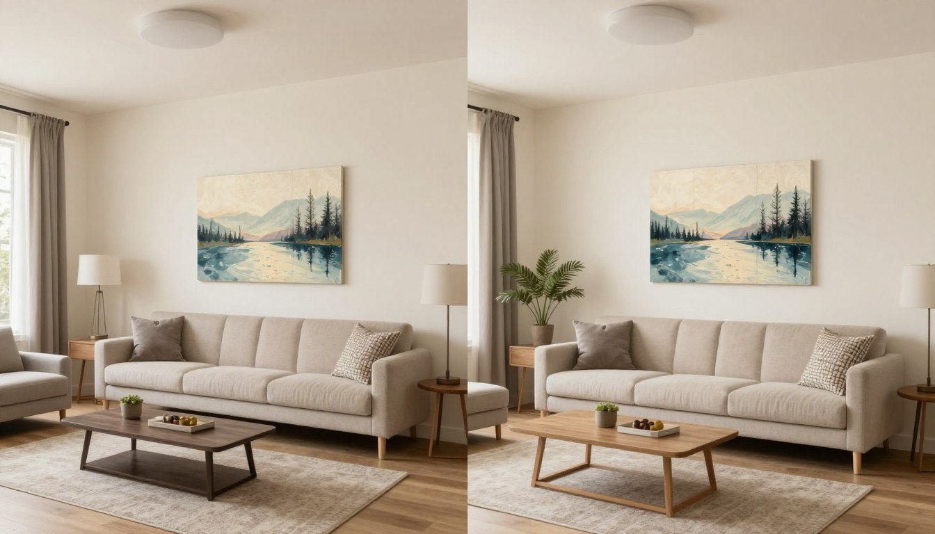
Place a swatch of each side by side and the difference is immediate: ivory looks cleaner and crisper, cream looks softer and more golden. Context matters too — ivory next to pure white looks warm, but the same ivory beside cream suddenly looks quite cool. Color reads relationally, not absolutely.
What Wall Art Works Best With Each
With ivory walls — lean into cool tones. Navy blue creates a classic, nautical-feeling contrast; soft grays build monochromatic sophistication; sage green and pale pink both add a soft accent without clashing; and black-and-white photography reads crisp and intentional against ivory's cool neutral base.
With cream walls — lean into warm tones. Terracotta and warm reds feel right at home; golden yellows and copper or bronze metallic accents play up cream's inherent sunshine quality; chocolate brown adds depth while keeping the temperature harmonious.
Shop the Original Paintings Collection →
Frequently Asked Questions
Is ivory warmer or cooler than cream?
Ivory is cooler than cream. Ivory contains subtle gray or blue undertones that create a cool neutral appearance, while cream has distinct yellow undertones that make it a warm neutral — the primary distinction between the two colors.
Can I use ivory and cream together in the same room?
It requires care, since the temperature difference can create a subtle clash rather than harmony. If combining them, use one as the dominant wall color and the other sparingly in accessories, or stay within one temperature family — layering several warm creams together, for example.
Which color makes rooms look bigger, ivory or cream?
Ivory generally makes rooms look slightly larger, since its cooler undertones and higher light reflectance enhance a sense of openness. The difference is subtle, and both colors work well in small spaces compared to darker alternatives.
What trim color works best with ivory walls?
Pure white trim gives crisp contrast with ivory's cool undertones, while ivory trim creates a seamless, tone-on-tone look that makes rooms feel larger and more open.
What trim color works best with cream walls?
Warm white trim (rather than stark white) keeps harmony with cream's yellow undertones while still providing definition; cream trim gives the same seamless flow as an ivory-on-ivory approach.
Browse the collection →
Keep Reading
- Colors That Go With Brown: 5 Pairings That Make Any Room Look Expensive
- What Are the 7 Fine Arts?
- Shop the Minimalist Textured Paintings Collection



Leave a comment
This site is protected by hCaptcha and the hCaptcha Privacy Policy and Terms of Service apply.