What Colors Go With Brown? 5 Best Pairings + Designer Tips
Warm vs. Cool Brown Undertones
Every brown shade leans warm or cool, and that undertone decides which pairings will feel harmonious rather than off.
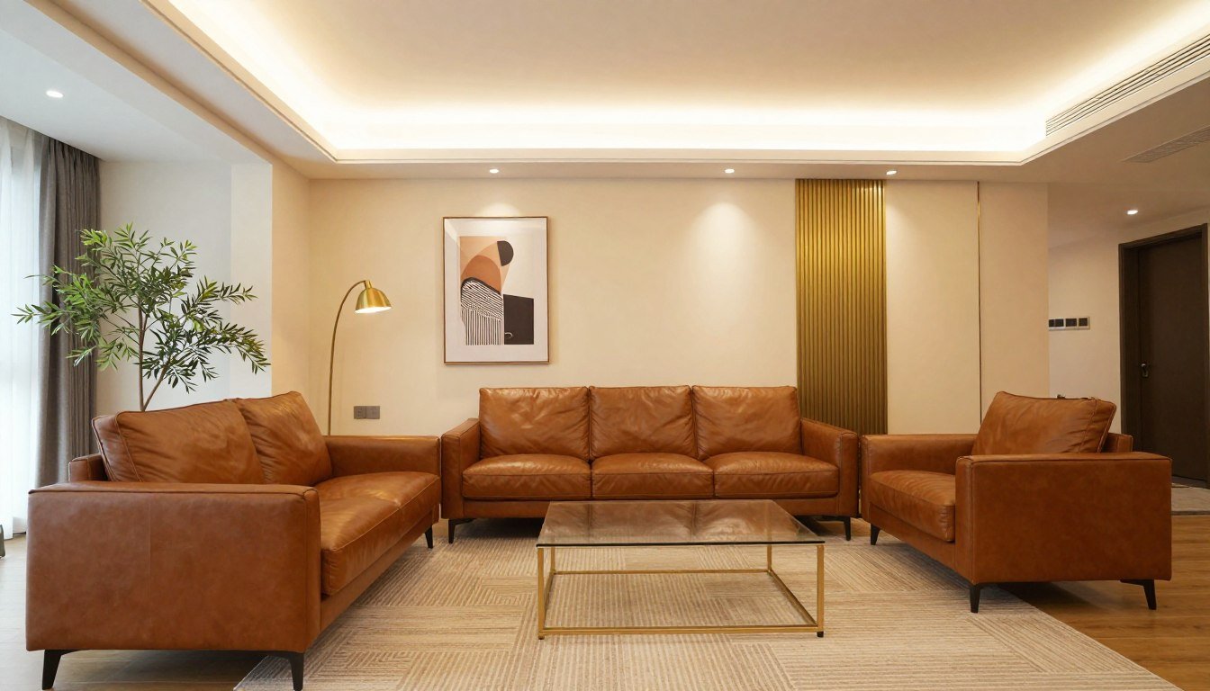
Warm brown undertones contain red, orange, or yellow notes. They pair naturally with terracotta, gold, and olive green, and create cozy, intimate atmospheres that suit bedrooms and living spaces.
Cool brown undertones lean toward gray or taupe. They complement blues, purples, and crisp whites beautifully, and work exceptionally well in modern living room designs and minimalist spaces.
5 Best Color Pairings for Brown
1. Cream — the safest, most classic pairing. Warm cream (ivory) suits warm brown; cool cream (linen) suits cool brown. Layer a few different cream shades so the room doesn't read flat, and add gold accents to bridge the two tones.
2. Sage Green — a soft, gray-green that offers visual relief from brown's warmth without fighting it. Ideal for bedrooms and any space aiming for a relaxed, natural feel. Botanical art or abstract pieces mixing green and brown organic forms reinforce the pairing. If you're building a green-and-brown palette, see what colors go with green for the reverse pairing guide.
3. Terracotta — an "Earthy Bohemian" combination that channels desert landscapes and Mediterranean villas. Both colors share warm, orange-red undertones, so they amplify each other rather than compete. Works beautifully layered with rattan, woven baskets, and greenery.
4. Blue (Navy, Powder, or Teal) — brown's actual complementary color on the color wheel, since brown is a desaturated shade of orange and blue sits opposite orange. Navy reads traditional and polished (good for offices or libraries); powder blue is softer and more casual (good for bedrooms); teal brings jewel-tone richness in small doses.
5. Gold — best used as an accent rather than a base color, at roughly 10–15% of the room. Gold lighting fixtures, mirror frames, and hardware add warmth and a touch of drama against dark brown walls or paneling.

How Much of Each Color to Use
The 60-30-10 rule keeps any brown-based scheme feeling balanced rather than accidental: use brown for about 60% of the room (walls or large furniture), your chosen partner color for 30% (rugs, curtains, upholstery), and an accent color for the remaining 10% (small decor, hardware, art).
Texture matters as much as color. Brown rooms can look flat without variation — mix smooth leather with nubby linen, glossy wood with matte painted walls, and a jute rug against sleek furniture to keep the palette feeling layered rather than one-note.

Shop the Original Paintings Collection →
Frequently Asked Questions
What Colors Go With Brown?
The most versatile colors that go with brown are cream, sage green, terracotta, and blue. Cream and beige create a soft, classic look, while sage green and terracotta add earthy warmth. For a bolder look, pair brown with navy or teal — brown's true complementary color on the color wheel.
What Is the Complementary Color of Brown?
Brown's complementary color is blue, since brown is a deep, desaturated shade of orange and blue sits directly opposite orange on the color wheel. Navy, teal, and powder blue all create balanced, striking contrast against brown furniture, walls, or wood tones.
What Color Goes Best With Dark Brown?
Dark brown pairs best with lighter, cooler tones that keep a room from feeling heavy, such as cream, soft gray, sage green, or dusty blue. Dark brown sofas and wood furniture look most balanced against pale walls and light textiles, which stop the space from feeling closed in.
What Colors Should You Avoid Pairing With Brown?
Avoid pairing brown with colors that clash in undertone, such as a cool, blue-based gray next to a warm, orange-based brown with no neutral to bridge them. Overly saturated brights in large doses can also compete with brown rather than complement it — use them as small accents instead.
Browse the collection →
Keep Reading
- What Colors Go With Green? 5 Best Pairings + Designer Tips
- Ivory vs Cream: What's the Difference (and What Wall Art Looks Best With Each)
- How Often Does the Eiffel Tower Change Color?
- Shop the Original Paintings Collection

About the Author
Chiara Rossetti
Chiara Rossetti is the founder of Rossetti Art, a canvas print and original art brand. She writes about interior design, wall art styling, and the art of making a home feel alive.


Leave a comment
This site is protected by hCaptcha and the hCaptcha Privacy Policy and Terms of Service apply.